An update on our site improvements, an explanation of what we do here, and a quick "Thank you."
If you are a subscriber here, we deeply appreciate your contribution to our subscriber-base. True, these subscriptions are currently free, but we want to show appreciation to anyone who expresses an interest in our content, especially since we are constantly trying to bring a better product to the public.
These site updates reflect that ethic. They are not yet fully complete, but we will get to that in a minute.
We want to be the preeminent entertainment publication for a culturally American, and faith-based media of all kinds. As a result we seek to inspire our media-makers to take the plunge and move out of Hollywood. To inspire these media-makers to make something better than, and more daring than Hollywood. And to remind the public that if they belong to a better culture, a culture of freedom, of truth, and of the gospel of Christ, then they need to support those who work towards this better culture.
Doing nothing is not an alternative.
This has been the primary issue. Not a lack of good artists but a lack of supporters who will stop consuming cultural poison and will make the move with us out of Egypt (that is, out of the immoral Hollywood culture that has taken over in the last decade, and longer).
So, we seek to inspire you with a literal, as well as metaphorical, alternative to Hollywood. It is a concept that doesn't yet exist in reality. Just as Moses led his people out of Egypt to a place that didn't yet exist, so this is our journey as well. The creation of a new culture that is concerned primarily with American values, and with pleasing God, not ourselves. This is the great work we are engaged with.
We give you (our subscribers) an opportunity to engage with us and hold us accountable to our goals that we show you on an almost weekly-basis. We discuss our articles, and our shows weekly... and on a monthly-basis we expand this discussion to our books, films, studio and website expansions, and our additional projects we have planned. Once a year (January 1st) we re-iterate our mission and give you an inspirational boost on why we are doing all of this great work.
This is how we are building community with you all.
We expect nothing from you but your support. This is not unconditional support. This is why we keep the lines of communication open to all of you who support us. We want to provide you with an avenue to offer advice if you are unsatisfied with our efforts. And if we cannot meet these demands, I understand if you decide you can no longer support us. We strive to do the best we can. This is all it means. It doesn't mean we will always succeed.
I say this because of what we are doing with our site.
.....
The site change has been going fine, and it has "updated" without any major issue. But this doesn't mean that everyone will "like" the new updates, or that "the way" its being updated will make everyone happy. If this is you please let us know.
Here are the potential issues I see:
- Yes, the site is up again, but it is not finished.
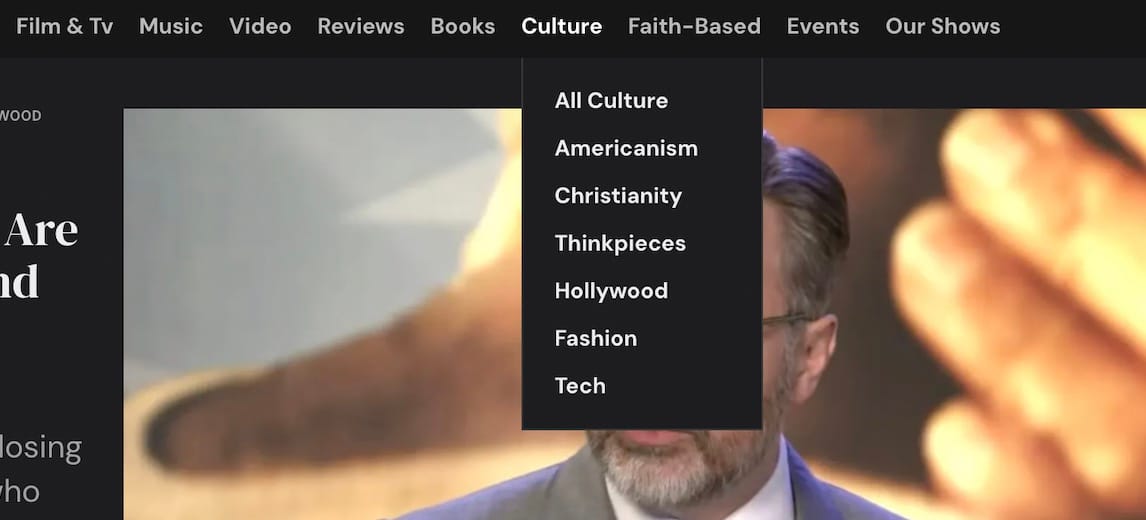
- The menu structure at the top of each page is not perfect.
- The submenus may bother some people.
- Each sections on the homepage (as you scroll down) will also need to be changed later.
- The new menu items (Events, Reviews, Our Shows) reflect a direction to travel towards, but we aren't quite there yet.
- We still aren't fully engaged with all social media yet.
So, these are some potential problems that many of you may notice and it may even bother you. We are sorry for any inconvenience to you. We appreciate any feedback on your particular experience with the site, or any preferences you may like to share. I consider this very valuable. Even if it's a deeply troubling experience you've had. If you let us know, it means a lot to me.
So, again, I wanted to let you know that each of these six issues above are ones that we are working on to solve.
The biggest issue for me also contains the greatest success... the top menus with parent menu and submenus.
DID YOU NOTICE? We got "submenus" which is exactly what I hoped for from this theme! Totally shocked!
But an issue that came with it was that the top menu items (the parent menu) didn't change color with the reading mode. This means that the color of the lettering remained black when you changed into reading mode (dark mode). This meant that the entire top menu disappeared if you turned on dark mode.
The exception to this malfunction was the menu style that I have in place now, which remains black with white lettering no matter what reading mode you have selected. Of course this menu style doesn't suit the branding of our site, so this will be updated and fixed once they have solved that coding issue.
If that cannot be fixed, we may either have to learn to code it ourselves (which sounds pretty difficult) or we may remove our submenus entirely.
Speaking of coding ourselves, we have been given some instructions on how to do some coding in order to add special sections on the mainpage. So, these are more updates that we plan to do, but they cannot happen right away. So, in the meantime, some imperfections will be present.
So far, as you may have seen, the site actually works pretty well, though. Yes, the logo at the top is not well placed or in line with our branding, but I absolutely love the submenus!
So, let's just walk-through the major changes...
- The top menu is currently black, has the logo to the side, and has submenus (rollover of the menu items reveals the submenus).
- Each section as you scroll down is of only two types. The top featured section and the list of sections (below that) that are all organized the same way.
- Subscriber Call-To-Action are included (down the page) only if you are not subscribed.
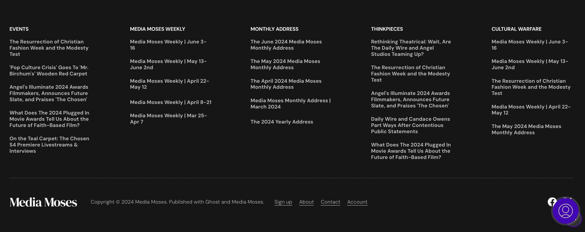
- New Sections were added to the homepage such as Events, Reviews, and Our Shows to the top menu bar, such as Media Moses (the mostly subscriber-only updates, which discuss the inner workings of the website) to the main body, and more to an extensive footer area with five new sections (Events, Media Moses Weekly, Monthly Address, Thinkpieces, and Cultural Warfare).
As it comes to a user-friendly experience the idea is to make what the site can offer more readily apparent and available to the new visitor (who may not be well-acquainted with what we do here). This is why a visually-interesting interface within each section is so important, and it is why adding more sections into the visitor's line of sight is so important.
Let people see what extensive bits of data are available to be seen and read here on our site. Let any new updates to the site add an additional bit of nuance and fun to the site, each time we add it. Curating new sections and tags that could be your own favorite go-to area.
Are you a film & tv lover? You know where to go.
Are you a youtube video lover? You know where to go.
Are you a music lover? We need to get more articles, yes. But, you know where to go. We now have a new subsection just for music videos, too.
What about culture discussions, or our thinkpieces, or our shows which discuss culture? You know which areas to go to.
Interested in only faith-based or family-friendly content? You know where to go.
Interested in more reviews of content? We hope to add more and more into this section, but now you know where to go.
.....
This has always been much of my intention from the beginning on how to organize the site. These sections and tags have always been of primary importance when it comes to how to find the content you are looking for on a website. Keeping it user-friendly in this way is the gamble when organizing any site.
So, these are the choices we made, and I think this particular theme has provided us with a lot of great options here. As I check the updates to the site, my hope is that this menu reader mode mistake will soon be fixed.
But, in the meantime we can enjoy a far more robust news site with more access to the variety of sections and tags that we have carefully curated for you. Some of these sections and tags need to get filled in more, but this provides us with a better structure to fill out and more goals to meet to make our site better and better!
Thank you for being our subscriber! Thank you for any feedback you give! And thank you for caring about our mission to make our culture a better one!
Did you enjoy learning about our new site updates? Let us know what you think down below (with subscription) or on our social medias!


